DYO BANNER HELPFUL HINTS TO SAVE YOU TIME!
Use a desktop/laptop (not mobile phone) to design your banner! If you experience any issues, try a different browser. Intermittent and slow internet connections will affect the speed and functionality of our builder. Print out 1st page only of these instructions for basics to guide you while you design your banner. (The full Design Studio Guide is below this.)
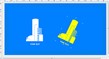
Once you hover cursor over your sport tab (at top), click on DYO banners. If you don’t see your category, you can also choose category (for ex) “Soccer Players (Boys)” or “Soccer Players (Girls)”. Once you begin designing, there are additional ART options since you can change the main character from (for example) a soccer player to a dragon, a girl to a boy player or an orange to an apple. On most templates, you can change uniform and other colors, but choosing a template that already has your team colors as well does save you time.
Once you click on a template with a background/style you like, answer the 4 questions in order to enter the DYO banner builder. Do NOT start from scratch! (Some samples have additional templates below as well, if you scroll down.)
Click on template to customize. Change the team name, player and coaches, change/add clip art and have fun! Below are some basics to get you started and save you time!
SAVE your design periodically with DIFFERENT file names in case we have any issues with your file/design ordered (so you don't have to start over). If you upload a file from outside our builder, best images are high-resolution png files (1500x1500px) and less than 5 MB. If you need to access prior designs saved, they can be found under your account (top right)/My Designs or once you log back in, under “My Designs”.)
Once you click on a template, to the left, see these icons: SETTINGS, TEXT, ART (These are the basics.)
CHANGE TEXT: Click/highlight the text you want to change and use the pencil to edit OR click on the TEXT icon to the left. You can add text, change the font type, text color and size, border stroke thickness, text shape, text spacing, etc. You can copy and paste the text and move it where you want on your banner to save time. (Tip: If you add an outline to font, you may want to use a contrasting color so lettering will stand out.)
CHANGE BORDER: Go to SETTINGS icon. Change border color and thickness, etc.
CHANGE MAIN CHARACTER, BALLS, ADD CLIP ART: Go to ART icon. Use the dropdown menu to select a different character or a different player, change the player ball(s), etc. You can copy and paste the image and move it where you want on your banner to save time.
CHANGE COLORS: Click on image you want to change colors. Find existing color in colors section to the left. Click on this color. Change the color. Click OK. If you change the color of one of the player balls, you can copy and paste and move it where you want on your banner to save time.
CHANGE ENTIRE BACKGROUND: Go to BACKGROUNDS bottom left. Then choose the category. So many options to theme your banner!.
USE TOOLS AT TOP TO FLIP IMAGES, CUT/PASTE, DUPLICATE, DELETE AND UNDO!
Click HERE or see below to view the Full Design Tool Guide.
PROCEED/Add to Cart.
REVIEW your artwork & spellings. View Actual Size first to make sure you don’t have leftover images to remove. Then also view Fit To Screen. X out/close and Proceed.
Proceed to Checkout.
If you can't find the design you want, please contact us and we will help you.
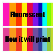
Our printers will not print true fluorescent colors, but we will do our best to print as bright as possible.
|
Design Studio Guide
TEXT “Add Text” will allow you to add your own text with choice of available fonts. Additionally you can also decorate the text with various effects like font size, bold, italics, font color, alignment w.r.t. design area etc. also when you click on this button will show all the texts in that panel so that you can quickly edit and update it. ART : This Tab will give you choice of available clipart in various categories. Click on any clipart to add it into design area. You can further select and edit clipart properties like size, color, border, alignment w.r.t design area etc. Many Shapes option allows you to draw shapes using free hand pencil tool, line tool, rectangle, and ellipse. Once you have drawn a shape in design area, you can decorate the shape with effects like outline, fill color, size, alignment w.r.t. design area etc. |
||
|
Draw Shapes Back to the top
 Clicking on the “Rectangle” icon opens a sub-menu palette offering the choice among two different options: Rectangle and Square drawing. clicking on these options will draw respective shape on the canvas.  Clicking on the “Ellipse” icon opens a sub-menu palette offering the choice among two different options: Ellipse and Circle drawing. clicking on these options will draw respective shape on the canvas.  Gives the option to draw a straight line and connect two objects by a line.
 The “pencil tool” allows freehand drawing. The thickness and the color of the strokes could be changed using the “Color Palette” tools. To draw these shapes, position the cursor in the design area and drag to the size of the shape required. Once drawn, you can edit object properties like fill color, border style, and color settings, etc. |
||
|
Editing/Decoration Options Back to the top
Border Stroke Color: This option enables various border color option for selected clipart, shape or text.
Border Stroke Dash Style: Allow option to select various border stroke styles for selected clipart, shape or text.
Border Stroke Width: Slider allows you to define the required stroke width for border for selected clipart, shape or text.
 
Choose Font: This option will provide you a choice of various predefined font type using drop down menu. Choose the one you like to apply on selected text object. Font Style: Change the font style to Bold or Italic as well as align it left, right or centre within text area. Align will work for multi line text object.
Align Align single object to left, right, centre, top, middle and bottom w.r.t. design area. When a group of objects is selected, you can choose to align all selected objects w.r.t. the smallest object in group, w.r.t. the largest object in group, w.r.t. each other as well as w.r.t. the page area.
Group You can select multiple objects (by dragging your mouse over desired objects or pressing “Shift” key and selecting objects individually) and group them by pressing the group button, which modifies the appearance of the selection. The objects once independent now appears in the group selection like a whole object. Before grouping, every individual object appears bounded by a dashed rectangle but after grouping dashed rectangles disappear and are replaced by a unique dashed line rectangle bounding the whole group. You can now edit all the objects in the group in one go with available editing options. Grouping affects also the “Icon Toolbar” appearance as group button is a toggle button which converts to ungroup button for current selection.
Ungroup This option works on a group of objects. Once ungrouped, each object can be managed and decorated separately.
Delete Object will remove the selected object only.
Delete All Scraps complete design from design area in one click.
Help Opens studio help content.
  |
||
|
Manage Layer Back to the top
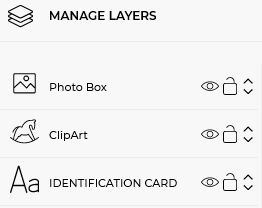 Layer Panel: Layers panel makes it easy to select any object and perform certain operations
|
||
|
Edit Clipart Back to the top
 You can change each single color available in clipart from editing panel. |
||
|
Group Editing Back to the top
 You can select multiple objects by dragging your mouse over desired objects or by pressing “Shift” key and selecting desired objects.
Multiple selected objects are shown with dashed borders. Now you can edit common properties of these objects in one go e.g. color, border settings, position, size etc.
|
||
|
Maximum Print Area Back to the top
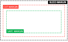 Safe Margin (green dotted line) |
||
|
Add Images Back to the top
 Add image allows the import of JPG, JPEG, PNG images from your local storage or from public image libraries from Picasa, Flickr and Instagram. Select the image upload option and add images to image gallery. Now, you can add any image from image gallery to design area by clicking on it. Now, you can further edit the image properties like size, positoin, rotation etc. |
||
|
Add Background Back to the top
 You can fill the background with any solid color from color palette or apply background image from image gallery offered by store. You can even repeat same background image on all pages of the product in single click, or apply unique background for each page separately |
||
|
Add to Cart Back to the top
 Once your artwork is ready and you are ready to order, click on add to cat to proceed to checkout and pay. |
||
|
Color Pallet Back to the top
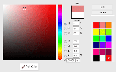 Clicking on the color icon open a dialogue box which allows setting the filling color choosing it in a palette or specifying RGB or HSV coordinates. |
||
|
Shortcuts Back to the top
SHIFT + CLICK CLICK + DRAG SHIFT(while resize) To Select multiple objects To Select multiple objects To resize objects proportionally |
||
|
Image Effect Module Back to the top
 In edit image pop-up, added a new tab for “Effects” using which user can apply image masks in different shapes; zoom in/out images and crop, apply image filters like sepia, black & white etc. |
||


